Tuesday, August 12, 2014

To Replace or Reface?

Whether you’re planning to simply spruce up your kitchen or do a complete overhaul, deciding what to do about your cabinets is one of the biggest decisions you’ll make about your new kitchen.

Obviously replacing your cabinets is a option, but refacing may be a viable choice as well. With cabinet refacing, the existing cabinet framework stays in place and installation takes just days, not weeks. Your kitchen remains functional, and there’s less remodeling mess. You can choose from a variety of styles, stain colors and wood species, all while staying within a reasonable budget.  Basically, refacing your cabinets means removing all your old doors and drawer fronts, refacing your cabinet framework with 3/16” solid wood or 1/8”3-ply hardwood panel, and installing new ¾” solid wood, custom-made doors and drawers with high-grade, self-closing hinges and decorative handles.

This allows you to drastically change the look of your kitchen while maintaining quality workmanship. In regards to cost, it really depends on the size of your kitchen, the materials, and style of the doors you choose. If you’re looking to update the style of your kitchen, refacing could be the way to go; you can change the style to be as subtle or dramatic as you like. You might be amazed to see the variety of options you have for cabinet doors, especially if you’ve been living with bland cabinets for awhile.

If your existing layout suits you and the structure of your existing cabinets are solid, refacing may be for you. It’s refreshing to know that besides saving you money and still giving you dramatic results, cabinet refacing can be an earth-friendly option as well. If being environmentally responsible is a priority to you – you’ll be happy to know that if you choose refacing over replacing, you’ll be keeping a lot of waste out of landfills. 

However, refacing isn’t viable for every kitchen remodel. The existing cabinetry must be high-quality to begin with and the current layout must suit the homeowners needs. If you dislike your layout or your cabinets are low quality, replacing may be the better option. 

Notice the kitchen below is dramatically improved with a kitchen reface. 

Before

After
  

Tuesday, July 29, 2014

Tuesday's Tip: How to Choose A Dayton Or Cincinnati Remodeling Company


Above Map: Dayton

Above Map: Cincinnati

Standing Out In A Crowd

When you type in “Dayton or Cincinnati remodeling” in a Google search, what do you see? You see a bunch of red dots with a bunch of different remodeling companies. And these are just the remodeling companies online; there could be double this offline! This made us think, if we were searching for a professional remodeler and typed this in our Google search, where would we begin? How can you tell one remodeling company from another? Here’s some tips on choosing the perfect remodeling company for you.

     Search for referrals & reviews. Where does the company get most of their clients?  
      View sites such as Angie’s List or Houzz and see what real people have to say. Kircher Design & Build (KDB) doesn’t pay for a lot of expensive ads, the majority of our clients are from referrals. Our name travels from one satisfied homeowner to the next.

      Ask questions over the phone before you begin.  Ask about associations, where they’re located, and how long they’ve been in business.
We belong to the National Association of the Remodeling Industry, Brookville Chamber of Commerce, and have had zero complaints on the Better Business Bureau. We’re located in both the Dayton & Cincinnati areas and have been in business for a little under two decades.  

Meet the remodeling company in person. Once you feel comfortable, ask them for previous clients and projects that you can refer to. Some good questions to ask these past clients include:
  •          Was the job completed on time?
  •          Were the workers neat and tidy?
  •          Did the price change significantly along the way?

Due to the fact that we are consistently recommended means that we put significant time and effort in asking you questions as well. We want to understand your vision for the new space as well as offering you our advice.

Review credentials. 
Over the course of the last 15 years KDB’s owners, John and Carrie, have both become certified Kitchen Remodelers (CKBR) through NARI (the National Association of the Remodeling Industry), and were even featured in the “Entrepreneur” magazine twice for excellent business practices. We have received numerous accolades for our dedication to our clients and excellence in craftsmanship throughout the years. We have been awarded Contractor of the Year for numerous projects since 2007. Our kitchens have been featured in Housetrends Magazine, Daytonian Style, and Country Living. Our employees hold several certifications and credentials including CKBR, CLC (NARI Certified Lead Carpenter), CR (EPA RRP Certified Remodeler), UDCP (NARI Universal Design Certified Professional), and Bachelor of Science in Residential Interior Design just to name a few. 
      
      Most importantly, don’t always choose the contractor with the cheapest price.
      Although it can be tempting, you usually shouldn’t go with the cheapest contractor. There are many reasons they could have the lowest price. They could use low quality materials, be desperate for business, or start with a low bid and as the project progresses, add unseen costs. Choose your remodeler based on their background, personality, methods, AND price. Always remember a quality remodeler will not give you a “low ball” offer.  We’ll give you the right price and promise to always deliver on what we offer.

Home remodeling can be exciting and fun! When hiring a remodeler, do your research and hire one with a solid reputation.


Tuesday, July 15, 2014

The Before & After


Ever wonder what a project looks like before the demolition, design, and build? Take a look at some of our transformations. Whether the project requires refacing, custom cabinetry, closets, or an entire bathroom or kitchen remodel, we utilize our highly skilled craftsmen to deliver remarkable projects. Here are some before and after shots! 


                                BEFORE                                                                 AFTER
 These cabinets and backsplash received a facelift!


The new walk-in closet with clothing storage includes an island to use as a place for shoe organization and to gather clothing essentials for the day.


As you can see, new cabinetry, a central island with seating, several large granite countertop surfaces, multiple sinks, and modern appliances were added.

This new master bathroom includes a shower, two vanity sinks, and a freestanding tub.

The above kitchen was built in the 1950's. This particular client really wanted a modern look but wanted to  maintain a somewhat traditional style in order to still fit with the look of their older home. Additionally, the client was looking for a unique design feature that could become a focal point in the room. They were looking for something unusual. After lots of thought, we decided to create a radius two-tiered bar using granite and metal. This became the central factor in all of the design work that followed. Of course, all of the modern amenities such as the new sleek appliances, great lighting, stone floors and backsplash were all important features as well. And yes, those are pink cabinets - what a difference!


This project called for custom refacing. The beautiful sleek shaker-style doors with stainless pulls, light-colored granite countertops and a tile backsplash with a sparkle of glass in the deco pieces, fulfilled the homeowner's dream of a remarkable facelift in her traditional home!


While the overall space of this bathroom was large, it was broken into sections because of walls and closets that were designed in the middle of the space. The result was a choppy effect, making the bathroom feel small. Their desire was to create a spacious, luxurious, contemporary bathroom. Therefore, we removed the existing walls to create more space, created one large vanity, designed custom linen cabinets, and built a large walk-in shower without a shower door. The client loves the unusual, modern mirrors and light fixtures as well as the copper and stainless mixed vessel bowls and contemporary stainless faucets!

This finished room is just as the client requested, a glamorous spa-like bathroom that is also functional for the aging or disabled person. The cabinets are specially designed, including grab bar mounting and a sliding opening for access next to the toilet. 

Thursday, June 26, 2014

Kircher Design and Build 2014 CotY Awards

2014 CotY Award Winning Projects

NARI invites its contractor members across the nation to compete for the prestigious Contractor of the Year (CotY) awards in recognition of their achievements throughout the year. The awards are presented by NARI Headquarters to NARI members who have demonstrated outstanding work through their remodeling projects. 

We at Kircher Design and Build were honored to receive two prestigious Contractor of the Year Awards for 2014 from the Miami Valley Chapter of the National Association of the Remodeling Industry.

Judges voted on criteria ranging from craftsmanship, innovation, functionality, and how well the needs of the clients were met. Competition was extremely high for the awards, as many of the finest remodeling companies vie in becoming Contractor of the Year in various categories. Taking the award for Residential Bath $30,001-$60,000 was a Kircher Design and Build project that transformed a small shower area into an open bathroom layout. Our client's old grandiose bathtub overwhelmed the room and there weren't enough vanity drawers. Their desire was to create a luxurious, contemporary bath retreat incorporated with a large walk-in shower, smaller tub, spacious vanities, and most importantly, a pedicure spa in which our client could soak her feet.

Take a look at the award winning project below!

Category:
Residential Bath $30,001-$60,000


Our client was ecstatic about this foot spa!


Residential Bath
Taking the award for Contractor of the Year in the Residential Interior category was a Kircher Design and Build project that was very unique. The client came to us with the desire to create a large entertainment area within their walkout basement. The client lives on a lake where they host many parties. The current bar could not even be labeled as adequate. They needed lots of seating and it simply didn't exist at the original bar. There were no visuals of the lake from the existing bar and no ability to view the TV from that bar. Therefore, no one ever sat there. The family loves football and enjoys watching professional and college teams compete. Their vision was to create a unique, high quality bar that would make them believe they were sitting in a sports pub, while at the same time giving them great views of the lake. Take a look at the great entertainment area for this fun loving family below!

Category:
Residential Interior

That is real astroturf adhered to the front of the bar!


Kircher Design and Build basement
The bar seats 12 people, each on a stool with a sports team logo

We were honored to be included in these awards, which showcase the best projects in our industry. If you would like more information on bringing our award-winning team into your project, contact us today!

  • Visit our website or Houzz.com for more projects
  • Call us at 937-696-9599 for a FREE consultation
  • Email us at carrie@kircherconstruct.com


Thursday, June 19, 2014

An Entire Home Remodel: Take A Look At The Bordenkircher Residence


As promised, here are a few photos from the Bordenkircher Residence! We were so fortunate to have Dan Feldkamp from Visual Edge Imaging Studios capture these beautiful images. What an exquisite space! 


Tuesday, June 17, 2014

Kircher Design & Build Has Gone Social!


We have gone social! Currently we're on Houzz, Google Plus, Twitter, LinkedIn, Pinterest, and stay tuned for... a NEW WEBSITE featuring some of our latest projects!

You may be asking...what exactly is Houzz?
(Source: Houzz.com/aboutus)
When founders Adi and Alon remodeled their home, they started the way these projects often do: with a tall stack of magazines and referrals for home professionals from people they knew. But after those piles of torn out pages failed to make their dream a reality, they felt stuck. There had to be a better way.
So they build Houzz. A place to browse and save beautiful home photos.  A place to find the right design and construction professionals. A place to connect with others who have been there too. Houzz started as a side project but has become a community of more than 20 homeowners, home design enthusiasts and home improvement professionals- across the country and around the world.
Whether you are starting a complete kitchen remodel or just looking for the perfect bedside table, the Houzz community of homeowners and professionals are there to help you. And when you are ready to start your project, Houzz is the best way to get inspired, discover products and to find and collaborate with the perfect architect, designer or contractor.

We now have 15 different projects on Houzz that you can browse through- and who knows, maybe one of them is yours! Check it out at Houzz.com

If you would like to connect with us, check the top right hand side of this blog page. We have the icons linked to our social media sites and we'd love to connect with you!


Monday, June 9, 2014

Customer Appreciation Day

As promised, here are some photos of our Customer Appreciation Day! The photo below is an outside shot of the home.


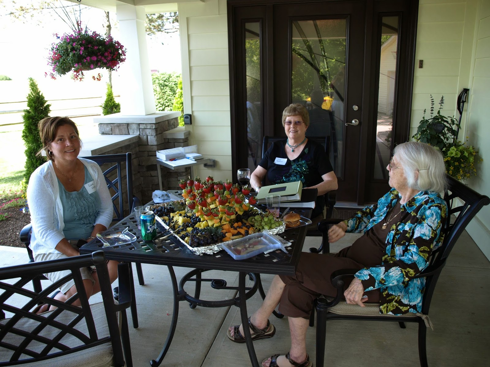
Attendees were able to enjoy some amazing food brought to us by Buckeye Jake's!

Here is a picture of the remodeled kitchen.

You may wonder why the Bordenkircher's decided to remodel their entire home... Well here's a little note from Carrie herself!

"After two years of marriage, we purchased this 1949 home in August 1992. It was purchased for $86,000. It was to be our starter home and we had no plans to live in it for more than 5 years. Little did we know... we would still be here in May of 2014!

We purchased the home primarily because it was located between our job locations in Lewisburg and West Carrolton... and because we fell in love with the yard. The home needed a complete over haul, which we immediately began working on. The following summer we added the deck and hot tub which still exist today. The fence you see around the perimeter was installed in 1994. Between 1993-1997 the bedrooms and living room were remodeled (for the first time).

In January 1997, John ended his career with the Iams Pet Food Company and purchased the Kitchen Solvers franchise. He used equity in his home to purchase the business. At that time, we decided to reface the kitchen cabinets and install new flooring and countertops. John believed he should attempt to install a refacing project since he was going to begin selling refacing for a living...and with that project he began the remodeling career that we have enjoyed for 17 years.

With the arrival of our two children, Alec and Corrine in 1996 and 1999, we needed more room in our home. At that time, we had both kids in the same bedroom, with the third bedroom serving as our home office. The home only had one bathroom on the main level. We considered moving again... but that yard. Where would we find another place like that? So we decided to take on another remodeling project...in the basement. It was completely unfinished and was not a walk-out at the time. We hired an excavator to move the dirt away from the home and expose the concrete wall. A landscaper installed the retaining walls that you see today as well as the paver patio and landscaping. Our employees installed the sliding door and window on the south wall, installed the drywall, interior doors, trim work, and lighting in the basement as you see today. This new space became a play room and a home office. The laundry room and a second bathroom are on the lower level as well.

For several years we were satisfied with the home the way it was, but there were some nagging issues with the layout of the home that had always bothered us. We talked seriously again about moving, but the kids were too involved in Valley View schools and didn't want to leave. And again... that yard. Nothing seemed to compare. So in 2012, we began designing and creating a new space which would involve adding on to the new home. The main goal was to create a large kitchen and dining area, master suite, and to define the front entrance of the home. We wanted a modern floor plan. Everything on the main floor with the exception of the hall bath has been remodeled in the last two years."
                  -Carrie Bordenkircher

Stay tuned for our before and after shots of the Bordenkircher home!

Contact Form

Name

Email *

Message *